


Visual Identity
Logos serve best as visual shorthand and are not capable of communicating the depth, breadth, and complexity of any organization. That job is best handled by a visual identity applied consistently to all of the organization’s communications materials.
A visual identity is more than just a symbol, logo, or icon. A well-crafted visual identity represents and reflects an organization’s unique products, services and missions. It is the sum of all the visual elements used by an organization to distinguish itself from competitors.
Visual identities should define an organization’s story and messages through content, images, text, color, formats, and other design elements. Images should represent the many different facets that are distinctive qualities of an organization.
History of the Unquowa Crest
At first glance, logos appear to require little time and effort to create. This is an illusion.
Well-designed, memorable logos are created through a complex process involving hours of research, design, feedback, redesign and refinement, administrative approval, and incorporation and implementation into a larger identity system. The process often is expensive and time-consuming, but usually well worth the investment of resources.
Influences
The condensation of the story of the Unquowa School since being founded in 1917 into a shorthand of visual symbols has a rich history. The Unquowa Crest today embraces the founding notion that Unquowa is a “fresh air school” as first described by Marietta Johnson in the spring of 1917 to a group of Stratfield residents. The latin phrase “cura futuri nobis” translates to “the future is in our care.”
![]()
The Value of the Unquowa Logos
A logo is not a brand. It is visual shorthand for a brand. A brand is the emotion, perception, or expectation associated with an organization, company, product, or service. The Unquowa logos serve as a visual shorthand for the Unquowa brand.
Instant Recognition
The Unquowa logo was created to reflect the strong attributes of this school: excellence, rich history, creativity, and tradition. Since then, its recognition among key audiences has risen significantly.
A Familiar, Constant Symbol
It’s not surprising that faculty and students see the Unquowa Crest as familiar; it is found on Unquowa building signs, vehicles, historical markers, banners, merchandise, advertisements, and print publications. It travels the world via the Web and is part of the School’s regional marketing materials.
The consistent use of the Unquowa logo adds value by associating the efforts of individual Unquowa departments with the overall excellence of the School. Despite the changes that are a natural part of an educational environment, the Unquowa logo remains a constant symbol recognized by our audiences.
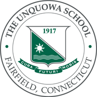
Two Versions of the Unquowa Crest
There are two versions of the Unquowa Crest: one with the surrounding text and one without. The Unquowa Crest with the circular text is known as the “round” version while the one without the circular text is known as the “standard” version.
Unquowa Crests
Round & Standard

Using the Unquowa Crest
The Unquowa logos must remain as originally drawn and proportioned and cannot be modified. The logos may not be deconstructed; for instance, the Crest may not appear without the other elements (such as the ribbon with latin phrase) that make up the Unquowa Crest.
Official Use Only
The Unquowa logos may not be used to promote or imply endorsement of non-Unquowa activities.
Events
School organizations such as the UPA may create their own type treatments, look, logos, etc., for special events, but should not incorporate or modify the Unquowa logos or any element of the logos—such as changing the latin text to text relating to a specific event—to create a new logo for the event.
Please note that the event-related type treatment, look, or logo may not replace the Unquowa Crest as the symbol for the campus. The Unquowa Crest must still appear on all print and digital communication materials according to the guidelines in the Graphic Standards Manual.
Buffer Zone
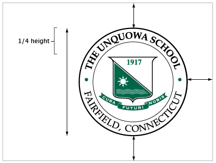
When either version of the Unquowa Crest appears alone, a buffer zone of at least one-fourth of the height of the Unquowa Crest should appear between the Unquowa Crest and any other design element. Note: A buffer zone larger than one-fourth of the height of the Unquowa Crest is preferred. Designers should not place any design element in close proximity to the Unquowa Crest in an attempt to make the two appear to be a unit.
Flexibility
There are rare instances where these guidelines should be flexible. Designers working under unique circumstances should contact The Unquowa School. All variances from this policy must be approved by the Director of Development/Marketing.
Adding Text
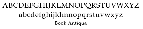
When adding text to “expand” the logo, use the font Book Antiqua in all caps; bold font for “The Unquowa School” and regular for “Fairfield, Connecticut”.
![]()
Color Palettes
Two color palettes are available for use with the Unquowa Crest, the typical palette and the professional palette. The professional palette offers a slightly more subtle approach with the black of the typical palette changing to a softer grey color.
The Unquowa Crest may be reproduced in a single color or in two colors. When a campus logo is reproduced in a single color, one of the colors from either palette is preferred, but any one color may be used.
When a campus logo is reproduced in two colors, it must be reproduced as shown here and the colors should never be inverted.
Colors viewed online can vary significantly from one monitor to another. Designers are encouraged to view the Pantone color chip in person.

| Professional Palette | Typical Palette |
| PRINT Pantone | PRINT Pantone |
| 431 / 341 U | Black / 341 U |
| C: 11 / 100 M: 1 / 0 Y: 0 / 67 K: 64 / 29 |
C: 0 / 100 M: 0 / 0 Y: 0 / 67 K: 100 / 29 |
| WEB RGB | WEB RGB |
| R: 82 / 1 G: 87 / 102 B: 89 / 72 |
R: 0 / 1 G: 0 / 102 B: 0 / 72 |
| Hexadecimal | Hexadecimal |
| #525759 / #016648 | #000000 / #016648 |
Typefaces
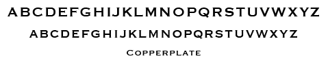
The primary typefaces for the Unquowa logos are Book Antiqua and Copperplate. Book Antiqua is used for the circular text element with “The Unquowa School” and “1917” in bold and “Fairfield, Connecticut” in regular. Copperplate is used for the latin phrase “cura futuri nobis” on the ribbon.
Correct Use of Unquowa Crest
Below are examples of correct uses of the Unquowa Crest. While only the standard version of the crest appears here, the examples apply to the round version as well.
 A. Correct use of the typical palette version.
 B. Correct use of the one-color version; all elements are the same color.
 C. Correct use of the professional palettte version. NOTE: When adding text to “expand” the logo, use the font Book Antiqua in all caps; bold font for “The Unquowa School” and regular for “Fairfield, Connecticut”.
 D. Correct use of the white version on dark green background (see description ‘E’). NOTE: When adding text to “expand” the logo, use the font Book Antiqua in all caps; bold font for “The Unquowa School” and regular for “Fairfield, Connecticut”.
 E. Correct use of the white version on a dark green background. NOTE: This is not a reverse-out version. Notice The green triangular field with the sun and waves – reversed-out, this would be white.
 F. Correct use of the typical palette version on a dark background. NOTE: The ribbon shows the white outline around it.
Incorrect Use of Unquowa Crest
Below are examples of incorrect uses of the Unquowa Crest. While only the standard version of the crest appears here, the examples apply to the round version as well.
 A. Do not alter approved colors.
 B. Do not modify the text in the ribbon.
 C. Do not use the Unquowa logos on an angle.
 D. Do not use any typeface when adding text to “expand” the logo other than Book Antiqua in all caps; bold font for “The Unquowa School” and regular for “Fairfield, Connecticut”.
 E. Do not alter the proportions of elements.
 F. Do not modify the logo by eliminating elements.
 G. Do not modify the logo by adding elements.
 H. Do not use a design that obscures the logo.
Unquowa Stationery
All Unquowa departments and organizations show affiliation with the School through the consistent use of stationery materials. Stationery materials include letterheads, second sheets, half-sheets, envelopes, memo pads, business cards, and mailing labels.
Before ordering printed materials, please review the specifications for the design, printing, and use of standardized stationery, including letterhead, envelopes, and business cards.
Guidelines for Unquowa Employee Business Cards
Standardized Appearance for All Cards
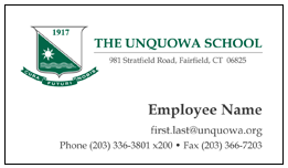
The Unquowa Standard Crest (professional palette) appears in the top left of the business card. The School’s name and address appear to the right of it as pictured above. An individual’s name appears in bold type in the lower-middle right, with that person’s title in smaller type below and right justified. All contact information appears below this at bottom, right justified.
Other logos and illustrations are not permitted.
Contact Information
Only Unquowa-related information such as mail, email, and Web addresses may appear on business cards, with the exception of telephone numbers. Campus office telephone number(s) must appear first, although cellular phone, pager, or home telephone numbers may appear as secondary contact numbers.
Guidelines for Unquowa Printed Letterhead
Standardized Appearance
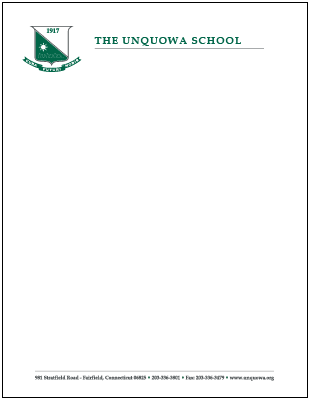
The Unquowa Standard Crest (professional palette) appears in the top left of the letterhead. The School name appears to the right of this. All other contact information, including phone, fax, and Web address, appear at the bottom center of the page. All other logos or illustrations are not permitted.
Names and titles
Individual departments, or organizations names or individuals titles do not appear on the printed letterhead. Identification of department or organization can be done in the signature portion of the correspondence.
Guidelines for Envelopes
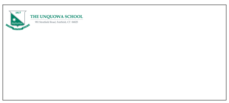
The Unquowa Standard Crest (professional palette) appears in the left corner of the envelope. School name and return address appear to the right of it as pictured above.
Writing & Media Style Guide
Clear, consistent writing is critical to the success of any organization. This guide is designed to help faculty and staff to write communications intended for general audiences.
This guide is just one tool available to teachers and staff. Specific entries in this guide supersede guidelines presented in other reference works such as The Gregg Reference Manual.
General Rules
Use abbreviations and acronyms only when they are familiar to your readers.
Use the full version in the first reference and follow it with the abbreviated form or acronym in parentheses. Subsequent references should be the abbreviated form or acronym.
Capitalize and hyphenate abbreviations based on the source word. No space should appear after internal periods. Use periods sparingly, such as when the abbreviation could be mistaken for a word if periods are omitted.
In text, the first reference to the school should be: The Unquowa School.
Acceptable second references include: Unquowa
Do not capitalize “school” when the word appears by itself as a noun or an adjective.
Correct: The Unquowa School is a world-class school. The school is one of the best schools in Connecticut.
Names and Titles
Abbreviate social titles Mr., Ms., Mrs., and Dr. when the titles appear before a name.
Use the abbreviations Jr., Sr., II, and III as part of a person’s full name. Examples: Everett McKinley Dirksen, Jr. The abbreviations Jr. and Sr. should appear with commas before and after the element.
There is no need to use commas to set off II and III when used as a part of a name. Example: Everett McKinley Dirksen III is not a real person.
Use periods after both first initials if the first name is hyphenated (J.-P. Mathy).
Use periods with no space if the initials are used instead of a first name. Example: E.B. Jones.
Don’t use periods or spaces when initials are used to refer to a person. Examples: JFK (John Fitzgerald Kennedy) or FDR (Franklin Delano Roosevelt)
Spell out civil or military titles when the title appears with a surname. Example: Lieutenant Colonel Blake. Abbreviate the title with a full name. Examples: Lt. Col. Henry Blake.
Time
Use abbreviations for the time of day in body copy, tables, and footnotes. Do not use capital letters. Example: 2 a.m. or 3 p.m.
Titles of Academic Degrees
Academic degrees generally should not be abbreviated. The following abbreviations for common degrees may be used when space is limited, such as a business card: B.A., bachelor of arts; B.S., bachelor of science; M.A., master of arts; M.S., master of science; Ph.D., philosophiae doctor (doctor of philosophy)
Use lowercase when spelling out degrees. Examples: bachelor of science, bachelor of arts, master’s degree.
Upper School, Lower School
Capitalize both
Grade/Classes
Use lowercase as a general rule. Examples: grade 4, fourth grade, kindergarten, preschool. Capitalize only if abbreviating. Examples: PreK-4, K, Gr. 4
Headlines
Capitalize the initial letters of each word, with the exception of articles, prepositions, and conjunctions with fewer than four letters.
Academic Degrees, Departments, Majors, and Programs
Use lowercase as a general rule. Capitalize proper nouns, titles, and acronyms and use lowercase for informal, shortened, or generic terms.
Examples
- the head of school; Sharon Lauer, Head of School; the head
- the Development Office; the director of the department
- Lisa Haseltine, chair of the Department of Mathematics; the chair
Use initial capitals for the names of academic degrees. Example: Bachelor of Arts in Dance. Use lowercase if the use is generic (bachelor’s degree in dance). Use periods in abbreviations. Examples: B.A., Ph.D.
Personal Names and Titles
Capitalize titles only when they appear before a name. Examples: President Mark Greenawalt, Governor Dan Malloy.
Lowercase a descriptive title when it precedes a name. Examples: history teacher, admissions director.
Do not capitalize titles when used alone in place of a name. Examples: the president and vice-president of the board, the governor of Connecticut.
Geographical and Related Terms
Capitalize geographical terms accepted as proper names. If a geographical term applies to more than one entity or is not regarded as a proper name, it is not capitalized. Regions are capitalized but compass directions are not.
Examples: the South, southern, southwestern (direction), the Southwest (U.S.), the West, western Europe, the West Coast, the Middle East, the Midwest (U.S.), west, western, westerner.
Time Periods
Numerical designations of a time period are not capitalized unless they are part of a proper noun. Example: the fifties.
Do not use an apostrophe to refer to multiple years in a decade. An apostrophe may be substituted for the 20th century. Example: the ’50s.
Calendar and Time Designations
Days of the week, months of the year, and religious and secular holidays are capitalized. Examples: Christmas Eve, Fourth of July, Labor Day.
Names of seasons or academic terms, or descriptive names for days (unless it is with the year) are not capitalized. Examples: spring, fall semester, summer session, election day, Fall 2003.
Religious Names and Terms
Names of religious bodies and their members are capitalized. Capitalize terms such as church and temple when part of an official name but not when the terms are used descriptively. Examples: Buddhist, Orthodox, Judaism, Roman Catholic Church (faith), A Roman Catholic church (building).
Commas
Commas should be used before a conjunction joining two independent clauses in a compound sentence. Example: She wanted to go swimming, but her mom told her to wait.
Use commas to separate two or more adjectives that modify a single noun. Example: She bought a pink, fuzzy sweater.
Commas should be placed inside quotation marks but outside of brackets and parentheses.
In a series of three or more phrases or words, separate all parts of the series with commas. Example: Jessica, Caitlin, and Stephanie went to the store.
Semicolons
Semicolons should be used in lists whose items include commas. Semicolons should separate closely related clauses.
Colons
Use colons to introduce a series or a list. Text following a colon only should be capitalized if it is a complete sentence.
Periods
Use periods to end:
- a declarative sentence;
- a quoted passage that also ends a sentence;
- a list of vertical items if some or all of the list items are complete sentences;
- a vertical list that is punctuated with commas at the end of each item.
Exclamation Points
Use sparingly, to indicate emphatic or emotional statements.
Apostrophe
Use apostrophes to show omitted letters, such as in contractions.
When referring to class year, use an apostrophe. class of ’89.
Use an apostrophe followed by an s when indicating the possessive for names, even when the person’s name ends in s. Example: The Stevens’s dog
An apostrophe and s should be added when forming the possessive of a singular common noun. The possessive of a plural common noun is formed by the addition of an apostrophe only. Example: the dog’s tail, the puppies’ tails.
Parentheses
Use for explanatory information that doesn’t relate to the rest of the sentence.
Brackets
Use brackets to enclose editorial comments, corrections, explanations, phonetic spellings, and the phrases To be continued and Continued from.
Hyphens and Compound Words
Compounds, or a combination of words regarded as a unit, take three forms: spelled as separate words (open compound); joined by a hyphen(s) (hyphenated compound); and spelled as one word (solid compound).
Telephone Numbers
Place the area code in parentheses: (217) 333-1000. If the area code appears in parenthetical text, use hyphens: 217-333-1000.
Italics and Quotation Marks
URLs in Running Text
When there is a need for emphasis, set off URLS in running text by using italics or boldface. Drop the “http://” element for websites with a URL that includes “www” for brevity’s sake. If the URL has no “www,” such as http://unquowa.org, the “http://” element should be dropped: unquowa.org.
Do not drop the “https://” element used to indicate a secure site.
Do not break a line on a hyphen or insert a hyphen; it can be misleading. Try to break the URL before or after the discrete units of the URL. If the URL is at the end of a sentence, it is acceptable to add a period.
Commas and Periods
Place commas and periods inside quotation marks. Colons and semicolons should be placed outside the quotation marks.
All other punctuation: If the punctuation is part of the quotation, put it inside the quotation marks. If it’s not, put it outside.
Use one space after periods.
Quotation Marks
Quotation marks should be used:
- to indicate the exact words spoken or published by a person
- the first time a reference is made to a nickname
- the first time an ironic or sarcastic phrase is used.
General rules
Advisor/Adviser
Advisor is preferred, although adviser is acceptable.
Online
Spell closed. Example: an online form.
“Pre” words
Spelled closed (prelaw, preprofessional) except pre-Columbian or other such compound words in which the second half is a proper noun.
“Re” words
Spell closed (reentry, reenroll).
Plurals
Plurals of proper nouns are formed by adding s. If the name ends in s, add es.
The plurals of numbers, multiple letters used as words, and words used as words are formed by adding s alone.
Apostrophes should not be used to form the plural of a proper noun unless it is to indicate possession.
Possessives
To form the possessive of a singular noun, add an apostrophe and an s. Example: the dog’s bone.
Email Addresses in Running Text
When there is a need for emphasis, set off by using italics or boldface; do not use angle brackets (<>).
Do not break a line on a hyphen or insert a hyphen; it can be misleading. Generally, try to break before a punctuation mark, moving the “@” or “.” to the next line: publicaffairs
@unquowa.org
If the email address is at the end of a sentence, it is acceptable to add a period.
Numbers
Spell out the numbers one through nine and use numerals for 10 and up.
Exceptions:
Spell out numbers at the beginning of a sentence.
Use numerals in percentages (4 percent, not four percent).
If more than one number is used in a sentence, spell them out unless all are 10 and over.
Ranges: use numerals and an en-dash: 1–10, not one through ten.
Addresses and Phone Numbers
Spell out words in an address unless space is in short supply. If so, use the following abbreviations: Ave., Blvd., Bldg., Ct., Dr., La./Ln., Pkwy., Pl., Rd., Sq., St., Terr.
The directions N.W., S.W., and S.E are abbreviated in an address. North, South, East, and West are not abbreviated.
As part of a name, spell out the word street, or avenue. Example: Green Street Coffee House.
Dates
The U.S. preference for styling dates is: month, day, and year without the ordinal letters. Example: January 1, 2006 and not January 1st, 2006.
The year may be abbreviated in informal contexts. Example: class of ’49.
Time of Day
To indicate specific times, use numerals with a.m. and p.m.
Delete the zeroes if the time of day is on the hour. Example: 5 p.m. not 5:00 p.m.
Use noon and midnight and do not use 12:00 p.m. and 12:00 a.m.
Spell out the time of day in text unless referring to a precise time. Example: She’s home from class by four.
Money
Delete cents when you have a round dollar amount. Example: $20 instead of $20.00.
Figures should be used for monetary amounts.
Use the word “cents” for amounts less than a dollar and the dollar sign for amounts of more than a dollar.
If the monetary amount is more than a million dollars, use the dollar sign and spell out million, billion, etc.
Decimals and Percentages
Figures should be used for percentages unless they start a sentence.
Percent should be spelled out in text. Example: She received a score of 82 percent on her exam.
Zeros can be used before decimal points, but not after, unless they are needed to show exact measurement. Grade point average, however, should always include two decimal places. 3.00 GPA (not 3.0 GPA)
School Name = The Unquowa School
PreK-3, PreK-4
Alumna/Alumnae/Alumni/Alumnus
Alumnus is the singular form for a man who has attended a school. The plural is alumni.
Alumna is the singular for a woman who has attended a school. The plural is alumnae.
Use alumni as the plural when referring to both men and women who have attended a school.
Emeritus/Emerita
Use emeritus when referring to male professors. Use emerita when referring to female professors. Note that this term should not be substituted for “retired.” Emeritus/emerita is a special status that must be officially approved by the school.
Nonsexist Language
Take reasonable steps to avoid unnecessary gender-specific language.
Avoid using a generic masculine pronoun when the antecedent includes both men and women.
Use substitutions for words with masculine markers when possible and logical. Example: firefighter instead of fireman.
Females over the age of 18 should be referred to as women and males over the age of 18 should be referred to as men.
Parallel terms should be used for men and women. Examples: ladies and gentlemen, wife and husband.
Women and men should not be referred to by their roles as wife and husband, mother and father, brother and sister, or son and daughter unless it aids in the comprehension of the content.
Take reasonable steps to avoid unnecessary use of the words “feminine” or “woman” as modifiers. Examples: woman doctor, feminine logic.
Format
Do not use fancy borders or backgrounds. E-mail should be simple and business-like.
Use Sans Serif font. You may use bold or italics for emphasis, but remember that due to individual e-mail programs, not everyone will “see” these options.
Make sure you use spell check.
Signature
Always included your name, position, The Unquowa School, the website, and phone number & your extension.
Example:
—
Your Name
Job Title/Position
The Unquowa School
(203) 336-3801 x 210
www.unquowa.org
Blogs
Faculty are responsible for regular blog post to the bulletin board on their classroom page. Once you have completed your blog for the bulletin board, checked the spelling and grammar and added any photos or links, chose the “Pending Review” option under Publish Status. Then email the Review Team, review@unquowa.org. Once the team has reviewed the post, they will publish it.
Photos/Videos
Not required for a website post but media of some type (photos, video or audio) is certainly preferred. Media should be inserted first followed by text/narrative comment. Images should be of good quality and uploaded at full size with 1024px wide and 768px high as minimum requirements. Insert images as galleries even if there is only one image uploaded.
If your text is very short (a sentence or 2) and you want to use photos, include them in a gallery rather than 1 large photo which will overpower the text.
Links to Other Webpages
Links to other webpages should be masked. Highlight the word or phrase which will become the link. Paste the link into the Link URL box. Click on Target to change if from “Not set” to “Open target in new window.” Click Insert. The text you have selected will now be blue underlined text. It should also be made bold and italic.
To include an email link, follow the steps above and in the Link URL box type in mailto:email@wherever.com (no spaces)
How to Download Logo Files
- In the navigation bar above, select either Standard Crest, Round Crest, or Other Graphics link to begin.
- Click on the view as larger image link to see a larger version of the logo. Click on the download zip file link to download a compressed file (.zip) to your hard drive; do not right-click on the logo images and save them.
- Expand the .zip file; inside is a folder containing images for use on PCs and Macs.
NOTE: Please review the Download Graphics General Guidelines before using the downloaded files.

Standard Crest – Professional Palette (with white background)
This zip file contains an Adobe Illustrator CS, Legacy EPS, Adobe PDF, 72 dpi PNG, 300 dpi PNG, and an RGB JPEG of this logo. Please consult the Graphics Standards Manual before using this logo.

Standard Crest – Typical Palette (with white background)
This zip file contains an Adobe Illustrator CS, Legacy EPS, Adobe PDF, 72 dpi PNG, 300 dpi PNG, and an RGB JPEG of this logo. Please consult the Graphics Standards Manual before using this logo.

Standard Crest – One Color (black for light backgrounds)
This zip file contains an Adobe Illustrator CS, Legacy EPS, Adobe PDF, 72 dpi PNG, 300 dpi PNG, and an RGB JPEG of this logo. Please consult the Graphics Standards Manual before using this logo.

Standard Crest – One Color (green for light backgrounds)
This zip file contains an Adobe Illustrator CS, Legacy EPS, Adobe PDF, 72 dpi PNG, 300 dpi PNG, and an RGB JPEG of this logo. Please consult the Graphics Standards Manual before using this logo.

Standard Crest – One Color (grey for light backgrounds)
This zip file contains an Adobe Illustrator CS, Legacy EPS, Adobe PDF, 72 dpi PNG, 300 dpi PNG, and an RGB JPEG of this logo. Please consult the Graphics Standards Manual before using this logo.

Standard Crest – One Color (white for green backgrounds)
This zip file contains an Adobe Illustrator CS, Legacy EPS, Adobe PDF, 72 dpi PNG, 300 dpi PNG, and an RGB JPEG of this logo. Please consult the Graphics Standards Manual before using this logo.
Round Crest – Professional Palette (with white background)
This zip file contains an Adobe Illustrator CS, Legacy EPS, Adobe PDF, 72 dpi PNG, 300 dpi PNG, and an RGB JPEG of this logo. Please consult the Graphics Standards Manual before using this logo.
Round Crest – Typical Palette (with white background)
This zip file contains an Adobe Illustrator CS, Legacy EPS, Adobe PDF, 72 dpi PNG, 300 dpi PNG, and an RGB JPEG of this logo. Please consult the Graphics Standards Manual before using this logo.

Round Crest – One Color (black for light backgrounds)
This zip file contains an Adobe Illustrator CS, Legacy EPS, Adobe PDF, 72 dpi PNG, 300 dpi PNG, and an RGB JPEG of this logo. Please consult the Graphics Standards Manual before using this logo.

Round Crest – One Color (green for light backgrounds)
This zip file contains an Adobe Illustrator CS, Legacy EPS, Adobe PDF, 72 dpi PNG, 300 dpi PNG, and an RGB JPEG of this logo. Please consult the Graphics Standards Manual before using this logo.

Round Crest – One Color (grey for light backgrounds)
This zip file contains an Adobe Illustrator CS, Legacy EPS, Adobe PDF, 72 dpi PNG, 300 dpi PNG, and an RGB JPEG of this logo. Please consult the Graphics Standards Manual before using this logo.

Round Crest – One Color (white for green backgrounds)
This zip file contains an Adobe Illustrator CS, Legacy EPS, Adobe PDF, 72 dpi PNG, 300 dpi PNG, and an RGB JPEG of this logo. Please consult the Graphics Standards Manual before using this logo.

Unquowa Gator – Four Color
This zip file contains an Adobe Illustrator CS, Legacy EPS, Adobe PDF, 72 dpi PNG, 300 dpi PNG, and an RGB JPEG of this logo.

Unquowa Gator – One Color (black for light backgrounds)
This zip file contains an Adobe Illustrator CS, Legacy EPS, Adobe PDF, 72 dpi PNG, 300 dpi PNG, and an RGB JPEG of this logo.

Unquowa Buildings – One Color (black with white background)
This zip file contains an Adobe Illustrator CS, Legacy EPS, Adobe PDF, 72 dpi PNG, 300 dpi PNG, and an RGB JPEG of this logo.

Unquowa Buildings – One Color (grey with white background)
This zip file contains an Adobe Illustrator CS, Legacy EPS, Adobe PDF, 72 dpi PNG, 300 dpi PNG, and an RGB JPEG of this logo.
File Formats
These different file formats allow the Unquowa graphics to be reproduced correctly in print and on-screen.
EPS Files
The encapsulated PostScript (EPS) files are for use in professional page layout and illustration programs such as Adobe’s InDesign and Illustrator and Quark XPress. Such programs are used to create documents suitable for reproduction via digital or offset printing processes at a professional printer. PC Adobe software users should set their screen display to high quality to correctly render the transparency of the EPS files. The EPS files were created using Adobe Illustrator CS 2.
PNG files
Use these files to quickly obtain the best rendering results for the Web and in PowerPoint. These files have a transparent background.
JPEG files
These files are 300dpi and are suitable for print if a professional page layout and illustration programs such as Adobe’s InDesign and Illustrator and Quark XPressis not available. Care should be taken as the background is white (except for the WhiteOnGreen versions) and will appear as a rectangle or square on any color other than white.
Recommendations
Resizing the Logo
To maintain the correct proportions when resizing the EPS file used to create the Unquowa logos, use Adobe Illustrator CS 2 and follow this process.
- Select the grouped objects in the file.
- Select “Object” in the pulldown menu and drag to “Transform” and then “Scale.”
- Check the boxes labeled “Uniform,” “Objects,” and “Scale Strokes & Effects.”
- Change the size by typing in a percentage in the “Scale” field or click “Okay” and resize the grouped objects with the selection tool.
Program Types
Microsoft Word should not be used for professional page layout or desktop publishing and is best suited for processing text that will be imported into professional layout programs. While Word contains templates for print, its ability to perform layout tasks is limited and a professional printer may have problems outputting the resulting files. For the best results, use Adobe’s InDesign and Illustrator or Quark XPress.
